Abstract Masters in Gold
The Golden Sun
Bauhaus Prints in Gold
from €9.99
GUIDES · STYLES
Circles, lines, a few strong colours and a lot of open space. Here is what the Bauhaus taught, why its posters still look modern a century later, and how to bring one into a room.
A Bauhaus poster is easy to spot even if you have never studied design: a few geometric shapes, flat colour, plain lettering set at an angle and plenty of empty paper. Behind that look is a school. Walter Gropius founded the Bauhaus in Weimar in 1919, with the idea that art, craft and industry should work together instead of in separate worlds.
The school moved to Dessau in 1925, then briefly to Berlin, and closed in 1933 under pressure from the Nazi regime. In those fourteen years it trained architects, weavers, carpenters, typographers and painters side by side. Wassily Kandinsky, Paul Klee and Josef Albers taught there, and every student began with a preliminary course in basic forms, materials and colour.
The posters the school printed for its own exhibitions and events followed the same lessons. Circle, square and triangle were treated as building blocks. Colour was limited, often to red, black, yellow and blue on white or cream. Type was clean and sans-serif, and Herbert Bayer, who ran the printing and advertising workshop from 1925, even proposed an alphabet without capital letters.
Composition mattered more than decoration. Shapes were placed off centre so the eye had to travel, and lines ran across the sheet to connect one block to the next. Kandinsky went further and linked forms with colours: yellow with the triangle, red with the square, blue with the circle. A good Bauhaus poster still feels like a small, exact machine for looking.
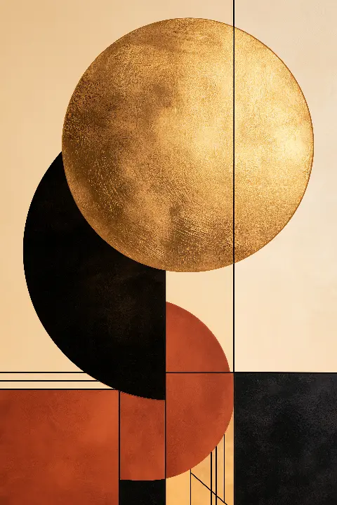
Our three Bauhaus prints are original compositions in the Bauhaus style; none is taken from a real exhibition poster, and each adds gold leaf to the strict geometry. The Golden Sun puts a large gold disc at the top of a cream sheet, with black and rust-red circles and rectangles stacked below it like building blocks and thin black lines tying them together.
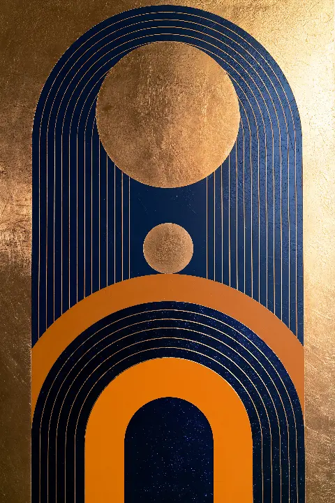
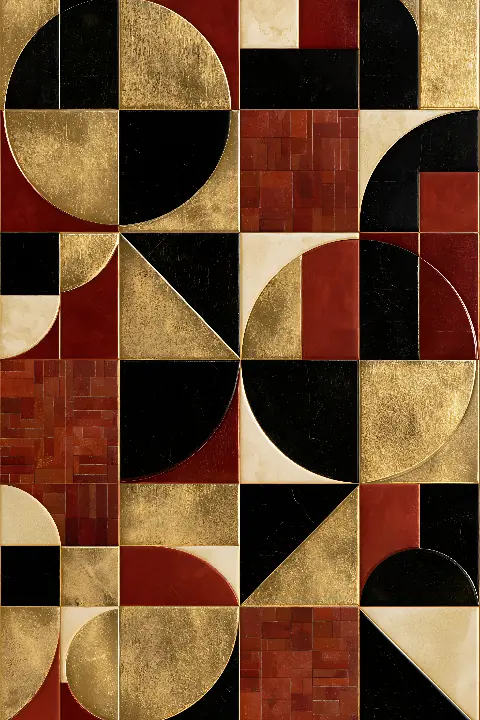
Arches in Navy & Gold is more architectural: orange and gold arches stack at the base and a tall navy arch rises above them, holding a gold sun and a small gold dot like a sun and moon in a doorway. The Golden Grid breaks the sheet into squares instead, each holding a quarter circle, a triangle or a plain block in gold, black, cream or dark red, turned in different directions.
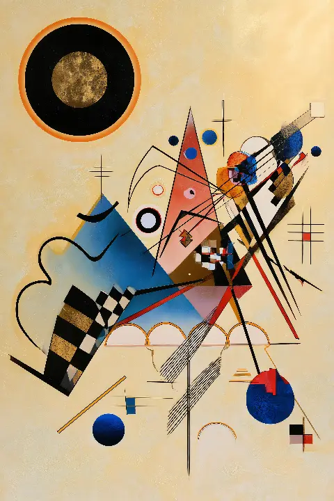
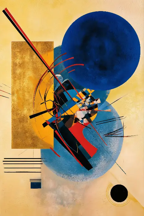
Kandinsky painted some of his key geometric works while teaching at the school, and three appear here reimagined in gold. Yellow-Red-Blue in Gold sets a tall gold rectangle against a deep blue circle on a warm yellow ground. Composition VIII in Gold scatters triangles, arcs and small checkerboards across pale cream, with a black-and-gold circle in the top left. Several Circles in Gold floats translucent blue, pink and gold circles on deep navy.
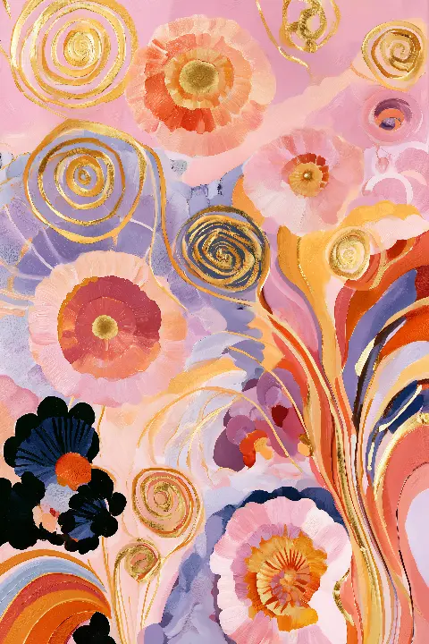
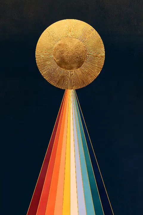
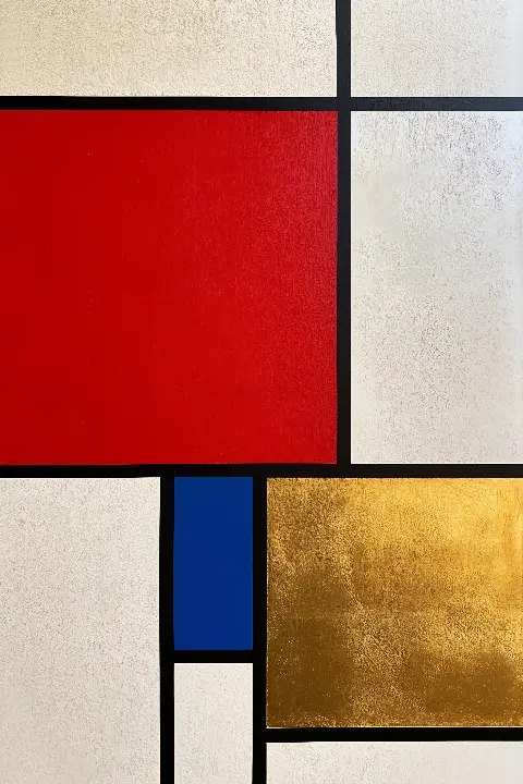
Composition in Red, Blue & Gold comes from a neighbouring movement. Piet Mondrian and De Stijl, founded in the Netherlands in 1917, shared the Bauhaus taste for primary colour and straight lines; here a big red block fills the upper left and a small square of gold leaf takes the place of his yellow. Hilma af Klint never taught at the school, but The Golden Altarpiece, a rainbow triangle climbing to a gold sun on navy, sits comfortably in the same company, and Rosettes in Gold, with coral, lilac and gold spirals on soft pink, shows her gentler side.
Start with the wall behind the Bauhaus poster. Cream, warm white and pale grey let the black lines and the gold read cleanly, which suits the cream-ground pieces. Navy, charcoal or deep green walls suit the dark-ground works instead, because the gold then carries the light. If you want one strong red in the room, the Mondrian piece gives it without asking the cushions to match.
Each work is a printable download; the portrait files measure 7168 × 10752 px and print sharply to about 60 × 90 cm. That is a 2:3 shape, so 40 × 60 and 60 × 90 cm fill a frame exactly, while 50 × 70 cm needs a narrow white border or a small trim. Every download also includes a Frame TV version, and printed versions are available on the site.
Bauhaus designers liked order, so hang the way they would have laid out a page. A single large poster over a sofa or desk looks right at about 60 percent of the furniture’s width, with 15 to 25 cm between furniture and frame. A pair, such as two of the Kandinsky works, looks deliberate when the frames share a top line and sit 5 to 8 cm apart.
Keep frames plain: thin black metal, natural oak or white, with no ornament to fight the geometry. The mistakes to avoid are hanging too small, crowding other pictures around one strong Bauhaus poster, and choosing a heavy gilt frame, which turns a modern image into a period piece. Let the open space on the sheet continue onto the wall.
Original geometric compositions and reimagined Kandinsky, Mondrian and Hilma af Klint works, each with gold leaf on a strict, simple structure.

It is a poster in the visual language of the German design school that ran from 1919 to 1933: geometric shapes, a limited palette of strong colours, clean sans-serif type and asymmetric layouts with generous open space. Our versions keep that geometry and add gold leaf.
No. The Bauhaus prints here are original compositions in the style of the school, and no real exhibition poster has been reworked. The Kandinsky, Mondrian and Hilma af Klint pieces are reimagined in gold after paintings that are now in the public domain.
Living rooms, home offices, hallways and kitchens with simple furniture suit them well, because the clean lines echo modern design. Pale walls work for cream-ground pieces such as The Golden Grid; darker walls suit Several Circles in Gold and its navy ground.
The portrait files are 7168 × 10752 px and print sharply to about 60 × 90 cm. Standard 2:3 sizes such as 40 × 60 cm fit without cropping, and each download also contains a version for a Frame TV.
Tell me the room and what you want it to feel like. I will send three works that fit, and a mock-up of each one in place.
Write to meThis site uses cookies for Google Analytics and Google Ads so I can see which pages and ads bring visitors. Nothing is sold or shared beyond that. Privacy