Pastel Masters
The Golden Strawberry Thief
William Morris Reimagined in Gold
from €9.99
GUIDES · ARTISTS
Thrushes stealing strawberries, willow leaves, a peacock in the foliage. Morris drew the English garden into Victorian homes, and his patterns still feel at ease today. Here is their story and how to hang them well.
Before you choose a William Morris print, it helps to know that Morris never thought of himself as a painter of pictures. Born in Walthamstow, then a village north-east of London, in 1834, he was a designer, poet, translator and campaigner who wanted ordinary rooms to be full of well-made things. He died in 1896, having changed how Britain thought about craft.
In 1861 he founded a decorating firm with friends, which became Morris & Co. in 1875. It produced wallpapers, printed and woven textiles, tapestries, stained glass and furniture, and it became the centre of the Arts and Crafts movement. His most quoted line comes from a lecture of 1880: have nothing in your houses that you do not know to be useful, or believe to be beautiful.
That sentence is still a fair test for anything you hang on a wall.
Every William Morris print starts with drawing from life. Morris sketched willows by the river, birds in the kitchen garden of his country house in Oxfordshire, and the flowers of English hedgerows, then turned them into designs that repeat without a visible seam. Stems curl and interlock, so the eye keeps moving and never finds the edge of the block.
The patterns were printed by hand from carved wooden blocks, one block for each colour. For textiles he revived indigo discharge printing at his works at Merton, south of London, from 1881: the cloth was dyed blue, then the pattern was bleached out and the other colours added. It was slow and costly, and Morris valued it for the depth of colour it gave.
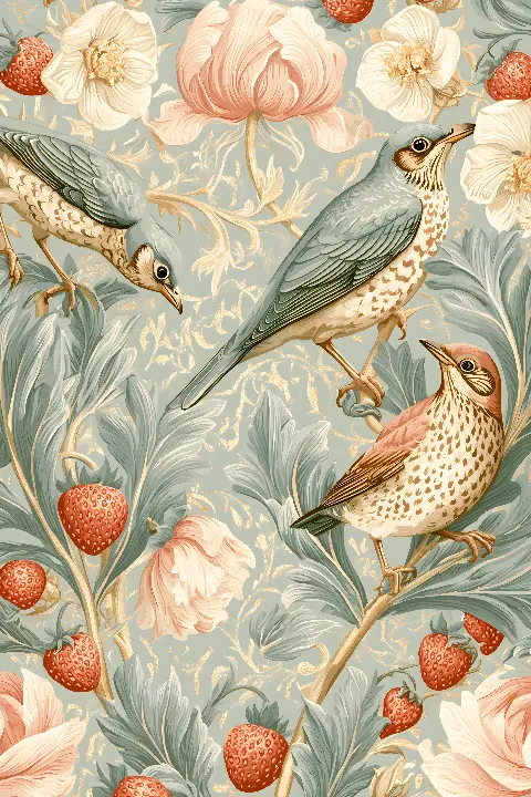
Strawberry Thief, from 1883, is the pattern most people mean when they search for a William Morris print. The Golden Strawberry Thief keeps the speckled thrushes, red strawberries and curling acanthus, sets them on a ground between sage and blue-grey, and traces the edges in fine gold lines that catch the light in tiny points.
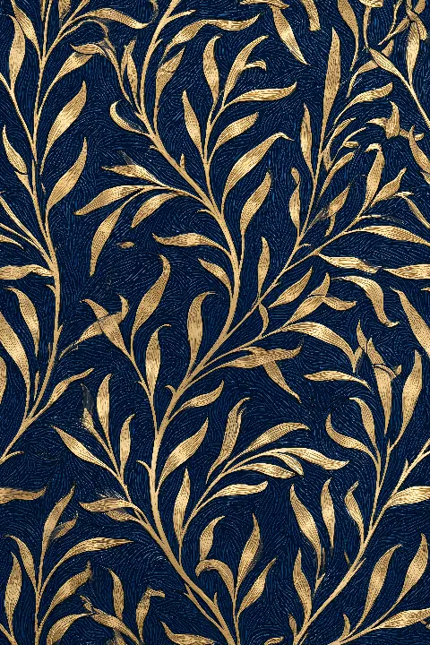
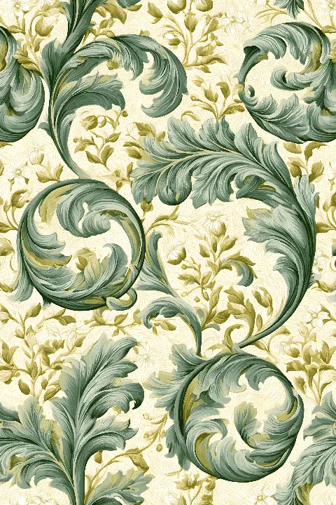
Willow Bough, a wallpaper of 1887, becomes The Golden Willow Bough: slim gold leaves hanging in clusters from crossing stems on deep navy, with no branch taking the lead. Pimpernel, from 1876, turns into Sage Pimpernel, where big sage-green leaves sweep across warm cream like breaking waves.
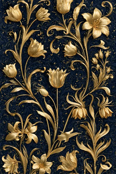
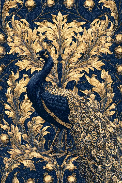
The Golden Peacock follows Peacock and Dragon, a woven fabric of 1878. Its peacock is drawn in navy only a shade apart from the ground, so it appears slowly, picked out by gold eyes along its tail. The Golden Lily, after a late Morris & Co. pattern by his pupil John Henry Dearle, sets lilies and tulips in upright gold columns on midnight indigo.
The indigo designs suit rooms that are already a little dark: a study, a dining room with deep green walls, or a bedroom painted in navy or charcoal. Gold on dark blue reads as a soft shimmer from across the room and rewards anyone who comes closer.
The pale works belong in brighter spaces. Thrushes and Peonies enlarges two thrushes until the pattern becomes one garden scene, with blush peonies and sharp red strawberries on sage. The Sage Strawberry Garden leaves more empty ground around each bird and flower, which makes it airy enough for a kitchen or a bathroom away from the shower.
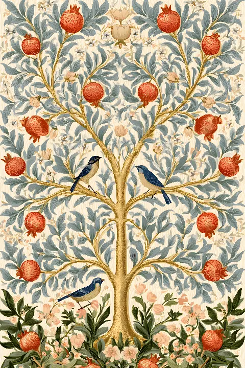
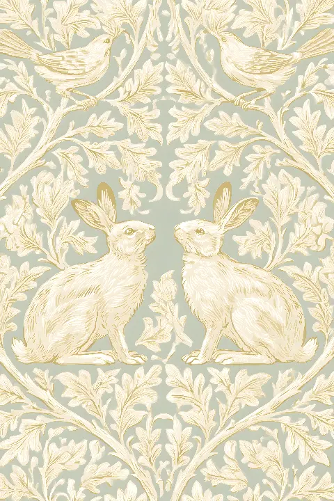
For a child's room, Brother Rabbit in Gold shows two cream hares facing each other in mirror image among leaves and small birds, all in close tones on pale sage. The Morris Tree of Life, an original design in his spirit, adds red pomegranates and small blue birds around a straight gold trunk.
A William Morris print is busy by nature, so give it a calm setting. If you already have patterned wallpaper or curtains, hang the print on a plain wall nearby rather than on top of the pattern. Warm white, stone, sage and deep green walls all suit his palette, and natural oak frames echo the Arts and Crafts love of honest wood.
Dense patterns need size to read. Small prints of a repeating design can look like a sample swatch, so choose a generous format, or hang two together. Every work is a printable download; the portrait files at 7168 × 10752 px print sharply to about 60 × 90 cm, and printed versions are available on the site. Each download also includes a Frame TV version.
The most frequent mistake with a William Morris print is hanging it too high. Keep the centre of the frame at about 145 to 150 centimetres from the floor, or 20 to 25 centimetres above the back of a sofa. Another is mixing too many patterns in one group: a pair of Morris designs from the same palette looks deliberate, while four unrelated ones look like a showroom.
Avoid glossy glass in a sunny room, because reflections hide the fine gold lines that make these designs worth a close look. Matte paper and non-reflective glazing keep the detail visible, and side light from a lamp brings out the gold far better than a ceiling spot.
Strawberry thieves, willow, peacock and lily: Morris designs reimagined in gold, in dark indigo and in soft sage.


Strawberry Thief, designed in 1883, is the most famous. It shows thrushes taking fruit in a garden and was printed by the slow indigo discharge method at his works at Merton. Willow Bough and Pimpernel follow close behind.
Yes. Morris died in 1896, so his designs are in the public domain. Our works are reimagined in gold after his patterns, with new colours and gold detail, and The Morris Tree of Life is an original design in his spirit.
Choose a pale design such as The Sage Strawberry Garden or Brother Rabbit in Gold. Their close, light tones keep a small space open, while the indigo designs are better on a larger wall or in a room that is meant to feel enclosed and cosy.
Natural oak or a slim dark wood frame suits the Arts and Crafts spirit. Add a pale mount for the denser designs, choose matte paper, and use non-reflective glazing if the wall faces a window.
Tell me the room and what you want it to feel like. I will send three works that fit, and a mock-up of each one in place.
Write to meThis site uses cookies for Google Analytics and Google Ads so I can see which pages and ads bring visitors. Nothing is sold or shared beyond that. Privacy