
Vintage Botanical Prints
Magnolia in Black and Gold
Vintage Botanical Print
from €9.99
GUIDES · COLOUR
Black and gold is the most dramatic pairing in decoration, and one of the easiest to get wrong. Here is how much gold to choose, which walls and lamps flatter it, and what makes it look cheap.
Black and gold wall art relies on one simple effect: a dark ground absorbs light and metal gives it back. Put the two side by side and the gold looks brighter than it really is, while the black reads as depth rather than as an empty surface. That is why a few thin gold lines on black can hold a wall that a pale picture of the same size would leave looking bare.
The pairing is old. Japanese craftsmen have sprinkled gold powder onto black lacquer for centuries in the technique called maki-e, and the designers of the 1920s and 1930s used black lacquer, gilded bronze and polished brass to give hotels, ocean liners and cinemas their glamour. Today the same contrast suits rooms dressed in charcoal, ink blue or bottle green, and it gives a white room one strong, graphic accent.
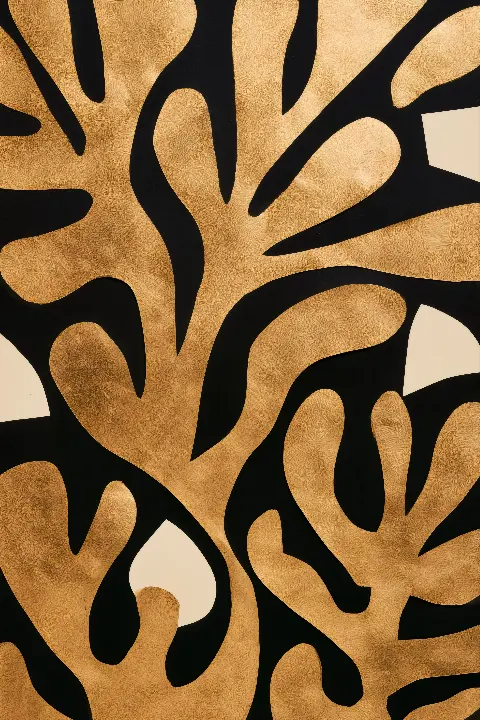
The first choice is not the subject but the balance. Some pictures are mostly gold with black showing through; others are mostly black with gold used as a line. In Golden Leaves on Black the large leafy cut-outs sit edge to edge, so the black survives only in narrow gaps and the whole sheet shines like a wall of foliage. It is a bold piece that works best as the only picture on its wall.
At the other end sits The Hand That Holds the Moon, drawn in fine engraved gold lines that reach up towards a thin crescent, which keeps the picture light despite its dark ground. Magnolia in Black and Gold lies in between: white petals, each outlined in a fine gold line, glow against matte black, so the gold sharpens the flowers rather than filling the sheet.
As a rule, the more gold a picture carries, the more empty wall it needs around it. Line-based works can be grouped closely; gold-heavy ones want space.
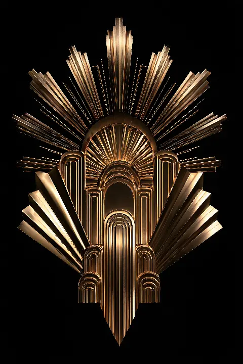
Hallways and home bars suit symmetrical, emblem-like designs that read at a glance. The Golden Sunburst does exactly that: stepped arches nest around fluted columns, rays fan out behind, and the whole ornament narrows to a sharp point, so it looks right centred above a console or a drinks cabinet.
In a living room you can afford a picture that rewards a longer look. Panther in the Golden Palms is drawn as one long horizontal sweep, the amber eyes the brightest point in the darkness, with gold palm fronds fanned out like cut metal. Hung above a sideboard between two brass lamps, it turns a dark wall into a scene.
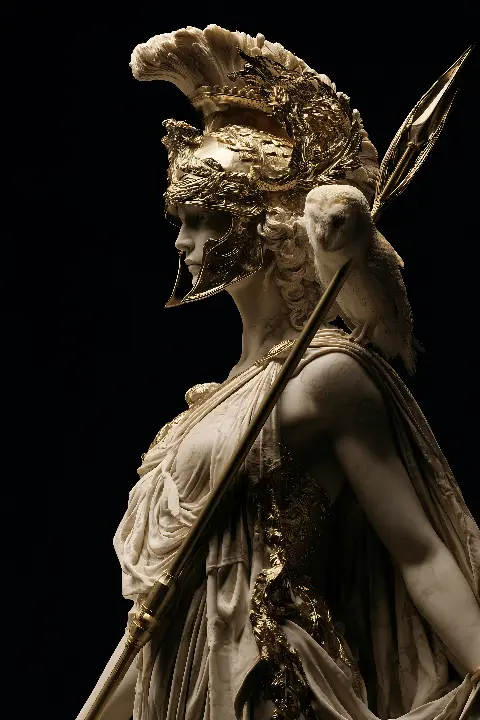
Studies and offices take something upright and steady. Athena in Gold shows a marble goddess in sharp profile with a gilded crested helmet and a small owl on her shoulder, while The Rearing Horse climbs in one diagonal, its body glowing bronze and gold against absolute black. Either gives a desk wall a focal point without clutter.
On a dark wall, black and gold wall art blends in at the edges and the gold appears to float. On a white or cream wall the black sheet becomes a strong rectangle, so the frame and its position matter more. Neither is wrong; decide first whether you want the picture to dissolve into the room or to stand out from it.
Gold changes with light more than any other colour on a wall. A picture light or a wall washer aimed from above warms the gold tones and lifts them off the black, while soft daylight from the side shows the modelling. Avoid a spotlight aimed straight on, which flattens the surface and causes glare if the print sits behind glass. If a window faces the picture, non-reflective glazing keeps the black truly black.

Black and gold wall art reads well from a distance, so do not undersize it. Every work is a printable download, and the portrait files at 7168 × 10752 px print sharply to about 60 × 90 cm, large enough to hold the wall above a sofa or sideboard. Printed versions are also available on the site, and each download includes a Frame TV version if you would rather show the picture on a screen.
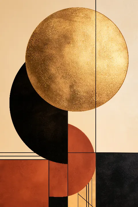
A thin black frame lets the image run to the wall; a slim brass frame repeats the metal and suits Art Deco subjects. Keep any mount narrow or leave it out, because a wide white mount breaks the contrast. Hang the centre at about 150 cm from the floor, or 15 to 25 cm above furniture. For a pair, The Golden Sun, a gold-leaf disc above black and terracotta circles on cream, sits well beside The Gilded Silhouette, a woman in a beaded dress inside a gold arch: one warm and geometric, one dark and figurative.
The most common mistake is too much. A gold frame, a gold mirror, gold cushions and a gold-heavy picture on one wall cancel each other out. Let the picture carry the metal and keep the objects around it quiet. The second mistake is mixing golds: a warm bronze and a cool champagne finish side by side look accidental, so stay with one tone across frames and fittings.
Finally, watch the scale of the black. A small black print on a large white wall looks like a hole. Either go larger, or group two or three pieces so the dark shapes form one block. Used with restraint, black and gold wall art feels formal and calm rather than flashy.
Nine works where black and gold carry the picture, from Art Deco ornament and myth to botanical line work.



Yes, if you choose a work where gold is used as a line rather than a solid field. Fine gold detail on black adds depth without crowding, and a dark wall behind it makes the corners of a small room recede. Keep to one or two pieces and leave space around them.
Charcoal, ink blue, bottle green and deep emerald let the gold float. Warm white, cream and stone make the black stand out as a strong shape. Very cool, bright white can make warm gold look yellow, so a slightly warm white is the safer choice.
It can, but reflections show more over a black ground than over a pale one. Choose non-reflective glazing, or hang the picture where no window or lamp faces it directly. An unglazed print is fine in a living room or study, but keep it away from cooking steam.
Aim for roughly 60 percent of the sofa's width, treating a pair as one picture. The portrait files of 7168 × 10752 px print sharply to about 60 × 90 cm, so two prints of that size with a small gap suit most three-seat sofas.
Tell me the room and what you want it to feel like. I will send three works that fit, and a mock-up of each one in place.
Write to meThis site uses cookies for Google Analytics and Google Ads so I can see which pages and ads bring visitors. Nothing is sold or shared beyond that. Privacy