JOURNAL · LIGHT
Gold and darkness: why quiet rooms need contrast.
Calm is not pale. A dark ground with one line of gold gives the eye somewhere to go and somewhere to rest — which is more than a beige wall can offer.
Raul Gabriel Nagy · 24 September 2026 · 5 min read
Beige is not calm. Beige is a room that has not decided anything yet.
The instinct, when a room is meant to be restful, is to take everything down to the same pale tone: walls, sofa, rug, and then a print in the same family so as not to disturb it. The result is not rest. It is a surface with no resting point — the eye slides across it and finds nothing to land on, and a place where the eye cannot land is a place where it keeps looking. Restlessness in a pale room is common and almost always misdiagnosed as too much stuff.
What the eye wants is one decision. A dark ground — navy, charcoal, black — and on it one line of gold. The dark takes the eye in and holds it; the gold gives it the single place to go. Everything else on the wall can then be nothing, because the decision has been made. This is why a black work with a gold curve on it reads as quieter, in practice, than a cream work with a grey one: not despite the contrast but because of it.
Where the gold should be
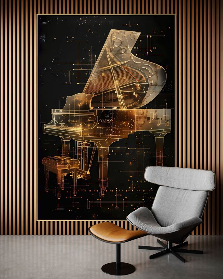
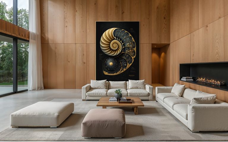
One line, not many. The works on this site that people hang in quiet rooms have a single subject drawn in gold and the rest of the surface kept dark and empty: the piano drawn as a gold blueprint on black, the nautilus scaled in gold on navy. A work with gold everywhere — gilded frames, gold leaf grounds — does the opposite; it is a wall that keeps talking.
Light it so the gold catches. A lamp to the side at roughly the height of the work, never a spotlight from above; the gold line is meant to be found in raking light, and to disappear when the lamp is off. A wall that changes with the light is a wall that is not the same at nine in the evening as at noon, and that is most of what makes a room feel lived in rather than staged.
Which works
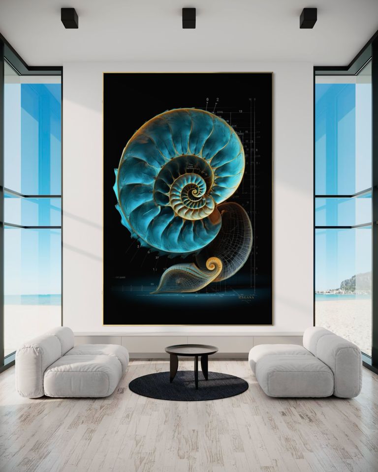
The Celestial Grand Piano is the clearest example: a grand piano as a gold construction drawing on black, made for a music room but hung as often in studies. The Golden Nautilus II is the same principle with a shell. Depth and Gold Resonance, cream and gold on charcoal, is for the room that wants the contrast softened one step.
Give the eye one thing to do and it will do it, and then it will stop. Give it nothing and it will look for something all evening.
From the studio notes


For a wall you're responsible for.
Tell me the room and what you want it to feel like. I will send three works that fit, and a mock-up of each one in place.
Write to me